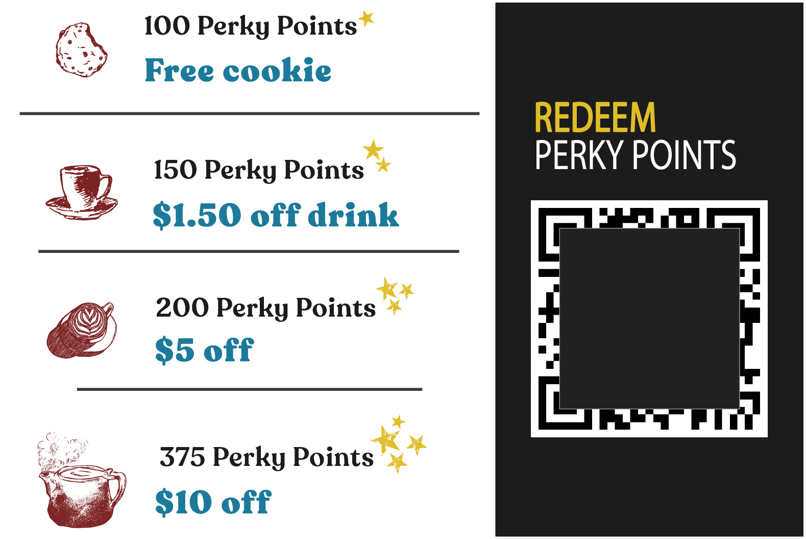
Exit Button

Humane Society Website

Second Chance Humane Society Mockup Website

my role

Researcher, Content Strategist, Visual, Usability, and User Experience Designer

The Humane Society stands as a representative for all animals in our community. As a fellow animal lover, I believe that my knowledge and skills can benefit the humane society by providing not only design aesthetics, but improving the user experience, adoption rates, donation rates, and volunteers.

product

Second Chance, Washington's newest humane society website! In this work, I focused on the people who love animals, their user experience, and strategizing the humane society's prosperous longevity.

mission

Second Chance Humane Society's main objective is to prevent animal cruelty, promote kindness, and support all animals by providing them with a second chance at a good life.

Research on Humane Society

I've got intelligence on my side

I started my research with consulting sites like the Humane Society of the United States (HSUS), the American Society for the Prevention of Cruelty to Animals (ASPCA), American Veterinary Medical Association (AVMA), and government databases to gather informative data on animal owner demographic, shelter/adoption agencies finances, and animal to shelter ratio. I found an article by Civic Science; Dog Shelters vs. Pet Stores- Who Shops and Who Adopts which helped show me how to guide users to adopting from shelters. From the article, the number one reason cited for not choosing a shelter is the belief that shelter dogs might have behavioral issues (15%). Others were concerned about the fees (6%), wanted puppies/younger dogs (6%), and many other reasons (12%). My job is to inform and recruit these lost potential adopters and those like them, by easing their minds on perceived negatives of adoption.

Project Goals!

I also went into other Humane Society's websites and reviewed them for competitive analysis. I specifically dove into Washington state with an emphasis on animal adoptions. Spokane Humane Society was a huge help with their 2020 annual report that had insight into their finances. I was able to learn how their income was coming in and their animal to shelter ratio. Most of their donations were from individuals, followed second by estates and planned donations. Their average length of stay for dogs was 29.6 days and for cats was 45.54 days. With donations mostly coming in by individual donations, this is the main target that I need to emphasize in my framework.

On the current humane society's websites, there were two common issues that a user would face; either not enough information or an excess of information that was poorly structured and difficult to navigate. There were also a lot of websites that ended with the user needing to call for more information and to schedule a visiting appointment. These are something I'm going to solve in my framework by adding only specific information in the adoption process.

Other Humane Society Research

Insights

To understand more about Humane Societies, I created an interview survey that's directed toward the stakeholders, workers/volunteers, and pet owners who have already gone through the process of adopting and/or shopping.

Download PDF

User Research

My user profiles are based on the findings from the 2017-2018 Edition AVMA Pet Ownership and Demographics Sourcebook. The information concluded most people own a dog more than any other animal with cats coming in second. Those aged 25 to 40 years old have the highest rates of pet ownership, followed second by those aged 57 to 75 years old. The less urbanized areas of the United States had the highest rate of pet ownership at 67%. Other important factors were wealth, educational attainment, and familial status. Individuals with higher income, post-secondary education, and/or married were more likely to be pet owners than their respective counterparts. Ethnically, pet owners were more white/caucasian with Latino/Hispanic as a close second.

User Persona: Joshua User Persona: Maria
Adpotion Journey Map
Sticky Notes for Planning

What is Needed

I wanted to create a space that would benefit both pet lovers and people involved with the animal shelter to encourage better communication, especially during the adoption process.

To achieve a successful website, Second Chance needs a certain amount of annual income to operate, a reduced number of animals at the shelter, and an increased number of volunteers.

  • Look at content to improve communication to the public.
  • Look into service design to integrate adoption processes.
  • Use current money processing for online donations.
  • Availability and accessibility of information.
Information Architecture

Good Additions

The website features a leading-edge design that incorporates modern web design best practices with inspiration from some of the world's most admired humane societies.

In addition to a good desktop experience, the new design is optimized for mobile smartphones to accommodate most users and help with the overall user experience.

The all-new design allows for easy navigation for the user to find their perfect new family member. Whether the user is wanting a small, medium, or large dog or short, long, or no hair cat- they can also search by characteristics, this allows for a no-hesitation adoption.

Wireframes for Mobile

Final Product Design

Mobile Screen of Second Chance Humane Society
Mock up Photo of Final Product
Exit Button

Beer Served to Perfection

Beer Box Package

my role

Package Designer, UX Researcher, and Graphic Designer

In this project I have learned digital, hand-rendered + print production related processes to achieve high quality material output. I go through essential 3-dimensional package design, specific to product and marketing materials. I create a cohesive set of complex collateral utilizing the method of process thinking with a focus on prototyping.

challenge & problem

The challenge I decided to take on was to engage with the beer industry and all who love beer. The problem was the beer package was either an aluminum can or a glass bottle which inhibit either the easy convenience or the quality and taste of the beer.

Research behind beer packaging

I've got intelligence on my side

The first order of business starts with research. And before going out into the field, I consume all knowledge I can find on the internet.

This is the fun part! Not only do I get to read case studies, but I also get to watch Youtube videos.

There's a basic choice that a beer company gets to make and that's Should I use Glass or Aluminum? See, many people will argue depending on quality and taste, but in the real world people will argue just on cost and production.

I do agree that the aluminum can has an ingenious design, so my idea is to capture the form of a can.

  • Cylindrical Form
  • Tab Opener
  • Bottom Dome

The Ingenious Design of the Aluminum Can

Check out my design inspiration:

Project Goals!

Project goal is to package beer with the quality that it was made. Doing so, glass is the best solution. Another project goal is to package beer with the great convenience that a can of beer offers for both the convenience that a can of beer offers for both the consumer and brewer.

Idealizing and conceptualizing the many possibilities for glass container convenience, I have decided on helping the environment by promoting re-usable cups!

Glass bottles are pretty basic and contain no other chemical ingredients besides the glass, so there's nothing in it that could really change the taste.

Cans are typically aluminum, lined on the inside with a polymer that can contain BPA or Bishphenol A.

Container Dimensions
Beer Research

Insights

My hypothesis:

Was correct. Glass is better. At least with backed up evidence on long-term thermal regulation. So, check out this case study I found that goes in-depth comparing the thermal performance of glass and aluminum beverage bottles during cooling and warming periods.

I decided on a reusable glass jar with replaceable lids similar to typical cans. This would allow consumers the ability to refill with any beer at any brewhouse without having to commit to the full volume of a growler. The glass achieves a few things; it is the smoothest and least reactive material, allowing for washing and reuse while maintaining the taste and integrity of each new beer, further the glass has a certain appealing texture in the hand that gives the consumer tactile satisfaction. The decision for reusable metal pop-tops is also multifaceted; they are cheap, easy to mass-produce, and recyclable while still granting the customer the satisfying 'CSHH' of cracking open a cold one.

Once I knew the direction the beer packaging was going, I started developing the prototype. This process took most of my time as iteration after iteration there was always something more to improve upon. Whether a better design that didn't require adhesives or a more comfortable handle, I recognized that usability also needed to be factored just as much as design. One of the main challenges that I faced was designing a lock hinge for the bottom of the box that would hold the weight of the beer. My solution was to use origami paper folding techniques to enhance strength.

One of the goals for my packaging design was to reflect both the utility and practicality of the product as well as reflect the draft-brewery capital of the US and my home - the Pacific Northwest. I drew inspiration for the packaging from my surroundings - to reflect the beauty of the Pacific Northwest.

The rugged high peaks, the blowing evergreens, and the abundance of majestic flowing water.

I wanted it to stand out from the more common black and brown color schemes, I chose a bold blue to match the cool environment. Through my research about why beer containers were designed to block most light, I discovered that the light from the sun could chemically damage the beer, degrading the taste and quality. The blue design of the packaging and container not only adds to the aesthetic, but blue is one of the most prominent wavelengths of light the sun produces, allowing my container to block the vast majority of sunlight and keeping the beer fresh.

Exit Button

Fayge Biotech

Role: Lead Graphic Designer, Motion Graphics Designer, UX Researcher

Expectations: Develop deliverables to convince potential investors that the science for Fayge is sound and that the business is scalable and replicable.

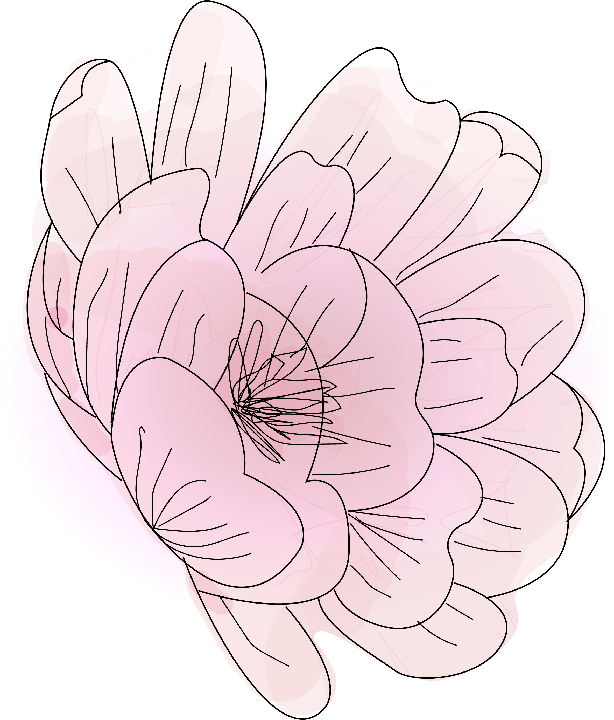
This poster was designed for the biotech start-up “Fayge,” a student group at Eastern Washington University looking to make a new acne medication. I designed the poster to be presented at an open house for funds acquisition.

The first step was to understand the context of the presentation, so I researched the basic science behind their product so that I could better develop the imagery. Because this project was directly intended to teach donors about the basic science, as well as to look like an appealing product they would want to fund, I took creative liberty to design the form and function of the imagery to both be telling of the intent of the product as well as to draw attention in a simple but eye-catching manner.

Fayge Science Information: Context

The next step was to create a creative brief that involved diving into more detail of the start-up's message, tone, people, and audience. I achieved this by answering SWOT: strengths, weaknesses, opportunities, and threats that are involved. The strength of the project was the idea itself- basic science research with wide market appeal. The weakness this team faced was how to present their research towards acquiring funding. The opportunity for this presentation was to acquire funding. The threats were the competition- needing to out-present 20 other student start-ups. Using this method, I believe that I gathered the perfect direction- they needed a visually appealing poster that explained the science and the market potential, allowing the team to talk about the science and the product to sell itself. I took this as a starting point to recognize that this poster needed to be a complete representation of their business and science.

Fayge Biotech Poster Planning Phase

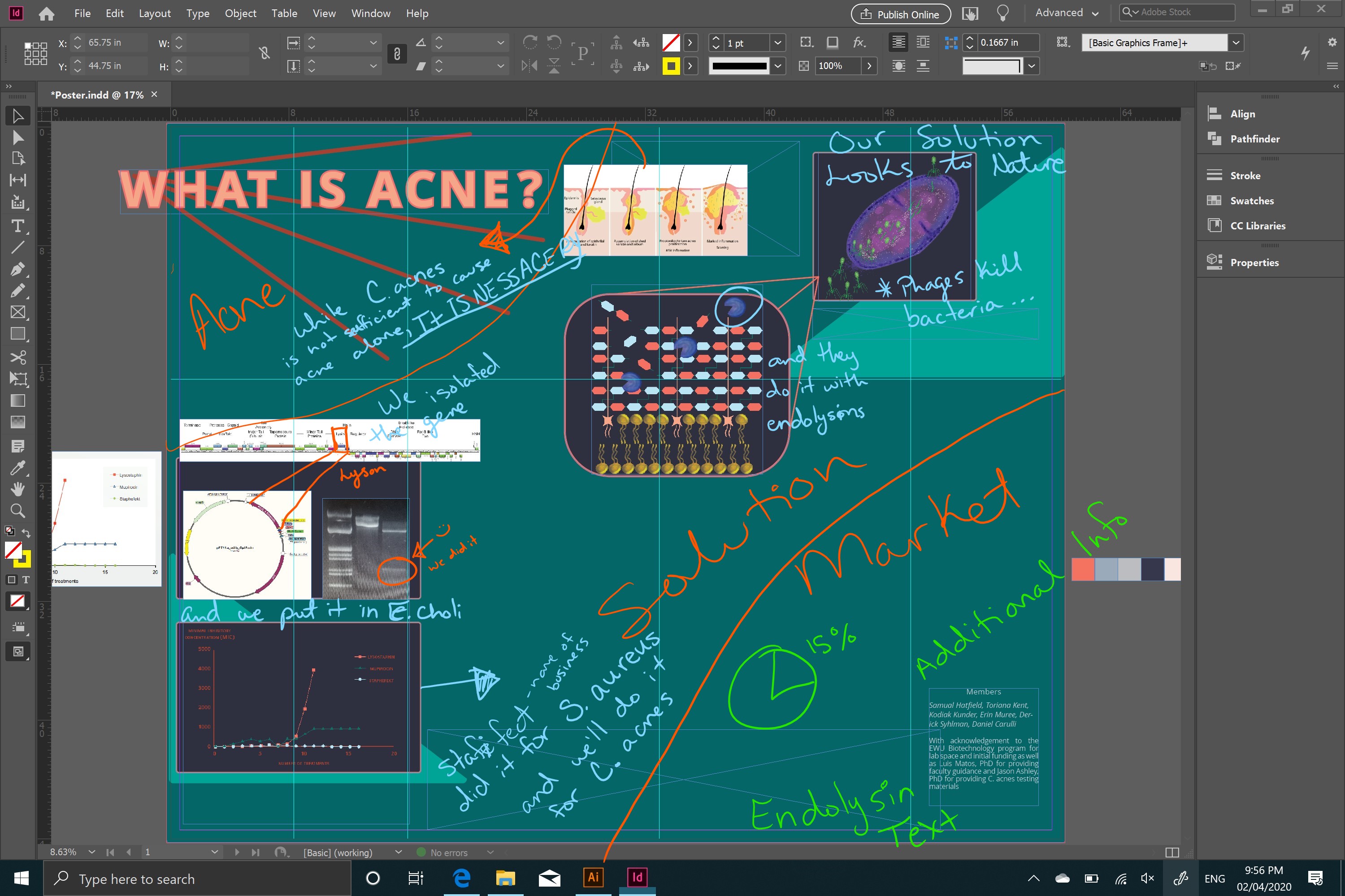
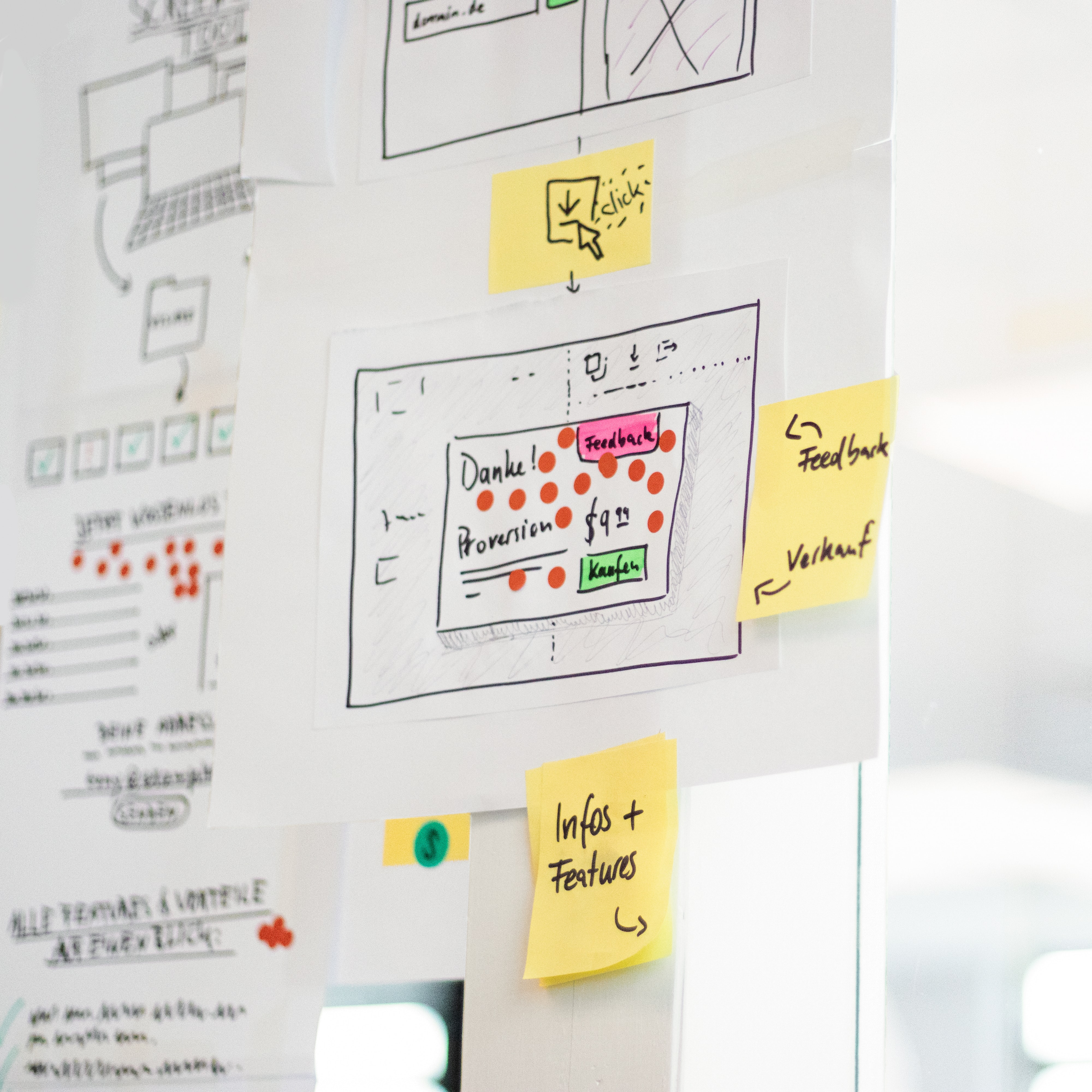
I always make sure to start with a sketchbook and pencils to get initial ideas down. I thought of cell biology as being organic and natural, so I wanted to stay away from sharp edges and have the concept naturally flow. Especially since the presentation was towards an audience that has varying levels of knowledge on the subject. The poster needed to connect easily with the viewer. The final poster layout took multiple iterations, but it was completed just in time to be printed and displayed for the presentation.

Fayge Biotech Final Poster Presentation

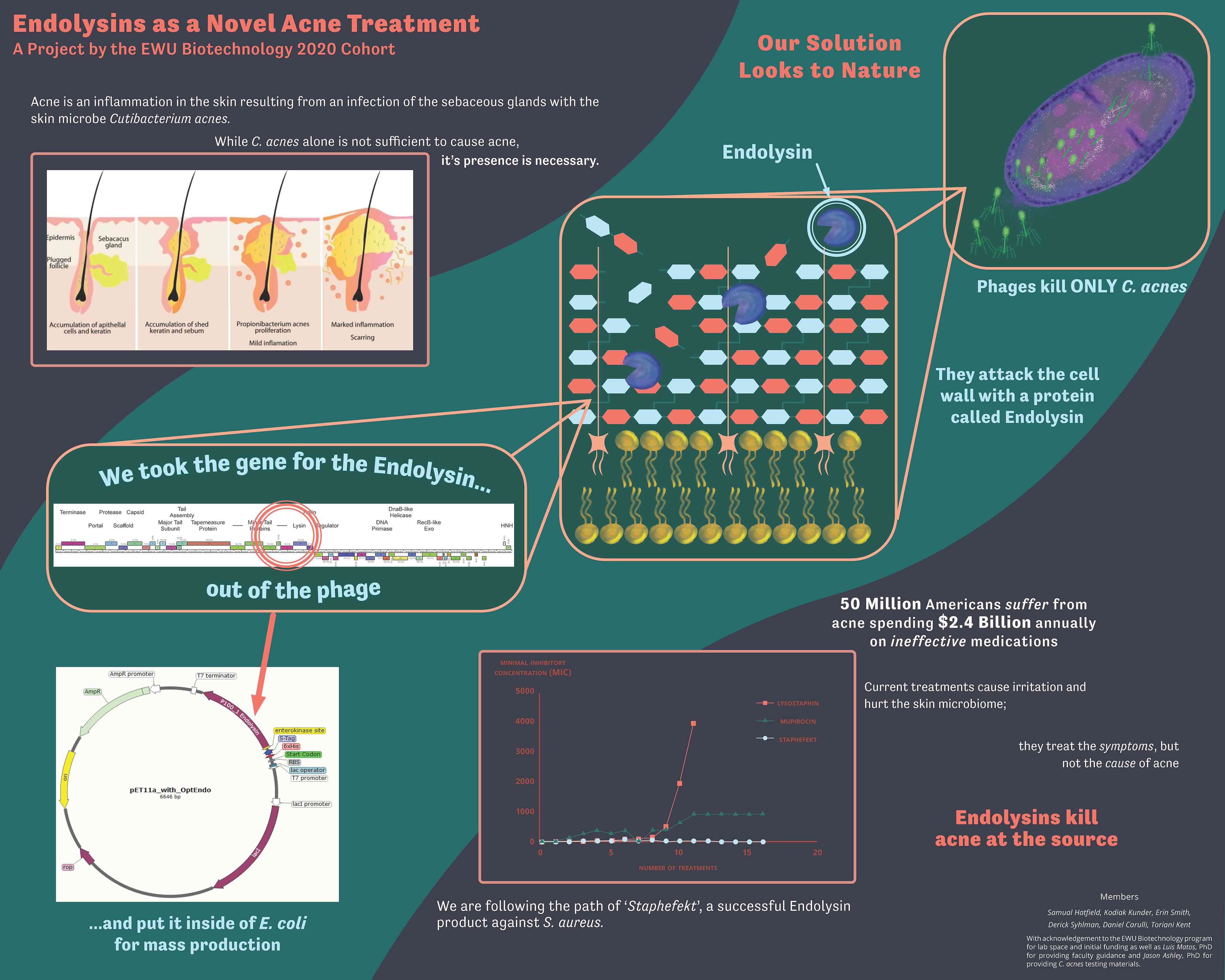
The poster composition was bold and colorful to grasp the audience's attention and all the visuals were easy to understand. With a storybook type positioning, the viewer naturally reads left to right starting with the top left corner to the right top corner and then the bottom left. Ending the person's perspective on the bottom right corner. Following this pattern, I guided the reader from the problem (acne) the issues (current treatments are inadequate) the solution (endolysin acne medication), and the resolution (needing funding).

The final service included the large poster, video animation, design guidelines, and a digital copy of the poster and video. The poster and video were praised at the open house, helping the client acquire $2,500 in funding.

Exit Button

Redesigning The Bird House's Digital Presence

New Non-Profit Organization Branding Style

The Bird House Home of Johnson County Iowa Website Homepage

Introduction:

As a Web Developer and Designer, my recent collaboration with The Bird House, a hospice home organization, stands out as a hallmark project that fully encapsulates my skills and impact in the digital realm. The Bird House sought a revitalized online presence to better connect with families seeking hospice care, emphasizing comfort, connection, and ease in their search. The challenge? To transform an outdated and inefficient website into a modern, user-friendly, and search-optimized platform.

My Mission

I aim to design The Bird House website to increase revenue and present an appealing site to attract clients, their families, and business investors.

Objective:

Increase search engine optimization by adding copywritten keywords which help search engines like Google better identify and recommend the services of The Bird House. The website was chosed to be developed in Wordpress, so I took advantage of Google Analytics, Semrush, Ahref, and Yoast plugins to help with data analytics and optimization tools.

  • I wrote all titles, slugs, meta descriptions, URLs, headings, paragraphs, image alternative tags, captions with utilizing keyword generators.
  • I added mobile-friendly optimization, internal links, and external links.
  • I also defined robots.txt, the sitemap, and verified the site’s loading speed passed the Core Web Vitals assessment.
  • Another attribute I really wanted to define was the website’s ADA Compliance assessment score.

Phase 1: Discovery and Definition

In my initial meetings with The Bird House team, I identified the core needs: a comprehensive digital strategy to enhance the organization's online visibility and user engagement. The current website presents an outdated visual design, which could be viewed as unprofessional. Additionally, the copywriting lacks keywords and information, which makes finding the website and searchability difficult. Updating the information architecture to improve ease of use and bring the website more aligned with ADA compliance would go far with the redesign.

Phase 2: User-Centric Research

My approach was grounded in empathy for The Bird House’s audience. Through interviews and surveys, I gained insights into the users’ journey, allowing me to design with a deep understanding of their needs and expectations.

The Bird House Site map and architecture

Phase 3: Strategic Planning

Leveraging the insights gathered, I developed user personas and wireframes to outline the structure of the website. This phase was crucial for visualizing the end product and ensuring that the new site would cater effectively to the users’ needs.

Phase 4: Design and Branding

Addressing the feedback on the website's "outdated" look, I structured the creation of a new logo and brand style guide. The redesigned elements reflect a mature, professional, yet welcoming identity, utilizing a refined color palette and typography to embody The Bird House's mission.

The Bird House Style Guide for Branding
The Bird House Site map and architecture

Phase 5: Prototyping and Testing

With designs in place, I built a prototype in Figma, presenting multiple design concepts. After selecting the preferred style, I conducted usability testing to refine and perfect the user experience, ensuring the website’s functionality and aesthetic appeal were in harmony.

Phase 6: SEO and Compliance Optimization

A key objective was enhancing the website’s discoverability through SEO. I integrated targeted keywords, optimized site speed, and ensured ADA compliance, significantly improving The Bird House’s online visibility and user accessibility.

SEO Keywords for Hospice Iowa Map 1 SEO Keywords for Hospice Iowa Map 2 SEO Keywords for Hospice Iowa Map 3

In Summery

This project with The Bird House not only showcased my versatility in web development and design but also highlighted my ability to lead a project from conception to launch successfully. My role was instrumental in transforming The Bird House's digital presence, directly contributing to increased user engagement and donations.

View the Website!

Exit Button

Loyal Rewards System Revamp

A Digital Marketing Success Story

Loyalty Rewards Assets and Information

Introduction:

In my role as the Digital Marketing Director at Iowa City Coffee Company, encompassing Java House Coffee Roasters and Heirloom Salad Company, I spearheaded the comprehensive overhaul of our Loyalty Rewards Program. This initiative was not just about enhancing a product; it was about reimagining how we engage with our customers, reward our loyal patrons, and significantly impact our bottom line. Here's how we transformed our loyalty rewards system into a powerful tool for customer retention and business growth.

Phase 1: Definition and Initial Concept

Objective:

The Loyalty Rewards Program needed a revamp to address critical business challenges: enhancing customer engagement, increasing average spending, and fostering long-term loyalty. The need for this product arose from direct customer feedback and market demands for more rewarding and engaging loyalty programs.

Process:

Initial stakeholder meetings helped us align on a high-level business strategy. We identified key areas for improvement: making rewards more attainable and engaging, simplifying the redemption process, and increasing program visibility. Our foundational approach included a low-fi concept sketch outlining a more dynamic and customer-centric loyalty system.

Phase 2: In-depth Research

Methodology:

We gained insights into the loyalty program's usability and appeal by observing customer interactions and conducting surveys. Analyzing data on sales trends and customer spending patterns revealed opportunities to make the loyalty experience more rewarding. This phase was critical for understanding our customers' needs and preferences, enabling us to design a program that truly resonated with them.

Download PDF

Phase 3: Analysis, Planning, and Roadmap Development

Outcome:

Armed with comprehensive research findings, we developed user personas and stories to guide the redesign. We planned additional reward tiers and more intuitive ways for customers to earn and redeem points. A detailed roadmap outlined the steps to revamp the program, including technology updates and marketing strategies to reintroduce the program to our customers.

Phase 4: Designing the User Experience

Focus:

Our design efforts concentrated on enhancing the user interface and experience of the loyalty program. This included a more straightforward check-in process, a clear display of rewards and points, and easy redemption options. We ensured the design was both aesthetically pleasing and functional, improving navigation and accessibility across all customer touchpoints.

Phase 5: Launch and Initial Results

Launch:

The revamped Loyalty Rewards Program was launched with a comprehensive marketing campaign, utilizing email, social media, in-store signage, and more to create buzz and educate customers about the new features and benefits.

Results:

The program's impact was immediate and significant. Within the first six months, we observed a 6% increase in sales from loyalty members and a noticeable uptick in average customer spend. These metrics validated our strategic approach and the program's alignment with our customers' desires.

Loyalty Program Engagement Analysis

First Month: 36% of sales were from loyal customers.
Last Month: 42% of sales were from loyal customers.
This indicates a 6% increase in the proportion of sales from loyalty customers.

Average Spend Analysis

First Month: Loyalty customers spent an average of $34.33.
Last Month: Loyalty customers spent an average of $35.79.
From the first to the last month, loyalty customers increased their average spend by $1.46.

Sales Growth Analysis

First Month: Loyalty sales were $177,051.38 which is 36% of the total sales.
Last Month: Loyalty sales were $191,959.24 which is 42% of the total sales.
There is an overall increase in sales from loyalty customers of $14,907.86.

Phase 6: Iteration and Continuous Improvement

Ongoing Process:

Post-launch, we continued to gather customer feedback and monitor program performance. This iterative approach enabled us to make targeted adjustments, ensuring the loyalty program remained relevant and valuable to our customers. Regular updates and new reward offerings kept the program fresh and engaging, driving consistent growth in participation and sales.

Conclusion: A Testament to Strategic Innovation

The Loyalty Rewards System Revamp is a testament to the power of strategic innovation and customer-centric design. By understanding and addressing the needs of our customers, we not only improved our loyalty program but also strengthened our brand's relationship with its community. This project underscores my value as a creative and strategic asset to Iowa City Coffee Company and demonstrates the impactful results that can be achieved with thoughtful digital marketing leadership.

Java House Cafe
fairy

Rochell Hatfield

Rochell Hatfield

Digital Marketing Strategist

Hi! I am Rochell Hatfield. My values are what define me, my lifestyle, and my work ethic. Results-generating, ambitious and driven, with a passion for analyzing, researching, and developing. Prioritizing, organizing, evaluating time, and self-management is what I do best. I create above and beyond goals and meet them effectively and efficiently. Among other things, I am diverse and set no limit to what I can do.

Scroll for More

personal avatar
background flower

Rochell Hatfield

Digital Marketing Strategist

DIGITAL MARKETING DIRECTOR

LOYALTY REWARDS SYSTEM

I revamped the loyalty rewards program to adhere to customer satisfaction, a long-lasting relationship with the customer, a higher spending percentage per customer, and a higher consistent customer revisit.

Java House Loyalty Rewards Program

USER EXPERIENCE DESIGNER

HUMANE WEBSITE

I researched and designed an animal humane society website to improve the user experience and usability for the humane societies prosperity.

Animal Humane Society UX Case Study Preview

WEB DESIGNER/DEVELOPER

HOSPICE WEBSITE

I researched, strategized, and implemented design solutions for the business' goals and objectives.

The Bird House Website Design and Development

WEB DESIGNER/DEVELOPER

SOCIAL PLATFORM

I designed and developed a social platform to expand my knowledge in using APIs. For this project I used a free cat API and it is mobile optimized. This project was more for the fun of learning by doing.

Social Platform Preview

PACKAGE/UX DESIGNER

BEER PACKAGE

I designed for a Pacific Northwest beer product. Let your wanderlust guide you to the next generation of beer packaging via “Pacific Pints,” inspired by the bounty of Nature in the Pacific Northwest.

Beer Package Design Preview

GRAPHIC/MOTION DESIGNER

BIOTECH START-UP

I designed a poster and animation for a biotech start-up presenting Lysin as a novel acne medication.

Fayge Biotech Poster Preview

Please message me if you would like to see more of my projects

Heart Icon

This website was designed and coded by Rochell Hatfield

Privacy Policy Terms & Agreements Sitemap

wireframing, wireframes, user experience, user interface, web design, product design, research, prototyping, data analysist, data Analytics, professional, experienced, highly committed, sales, business, marketing, brand strategy, brand strategist, senior level, work experience.